Report Features
This section examines features of the reports. The procedures for understanding and operating the reports are detailed elsewhere in the guide.
You should read this section to help you understand the material in other sections of the guide.
Reports available
Two types of reports are available for the supervisor on the Buzzeasy admin portal: realtime and historical.
The realtime reports offer today data: aggregated since last midnight. Because the data is current and presented in as close to real time as possible, it helps you manage the immediate needs and performance of the contact center.
Historical reports collect data from longer time periods and uses different aggregation schemes to access older events and to extract trends. We also offer raw historical data in programmatic (API) interfaces for developers aiming to add custom analyses and/or to represent historical data in their own systems. In addition, we offer Microsoft Power BI report templates with lots of predefined aggregations, filters and visuals on top of this raw data API.
Dashboards
Portal reports can group related key performance indicator metrics together in dashboards. The Queues and Teams realtime reports offer dashboards of KPIs for the queues and teams and agents.
You will only see dashboards of data you have associated to, e.g. queues and teams.
Key performance indicators
KPIs are individual measures (counts, averages, summaries, etc.) calculated from your today data to indicate the actual performance specific aspects of your contact center.
For example the number of conversations waiting to be connected with an agent right now is a queues report KPI. The number of currently logged in agents is a KPI from the teams report.
Data visualizations
While some KPI data are presented as simple numbers or texts, others offer graphical visualizations as well like bar charts, stacked row charts and "speedometer" displays. They make the data easier to understand.
A sample speedometer:
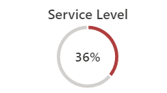
The outer ring of the speedometer changes color to indicate progress towards a target, or a growing risk, etc.
A stacked horizontal bar chart:
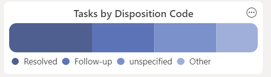
The entire bar represents 100% of the data and all categories contributing to the data. Each category is represented as a percentage of the overall total.
Data thresholds - highlight critical KPI values
Visualization style can represent changes too. If a KPI visualization turns red from green, this indicates that the data has exceeded a set threshold and likely requires supervisor intervention.
The Waiting KPI from a queues dashboard, its value below its data threshold:
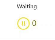
It shows how many conversations are waiting. Since none are waiting, the value is zero, it is displayed in yellow. It is because the threshold to change the formatting has not been reached.
The same Waiting KPI over its data threshold:
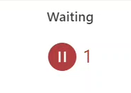
In this example a Supervisor has set the threshold of the Waiting KPI to 1. With one call waiting, the KPI visualization turns red.
Navigate to the individual report documentation from the menu at the left to see how to edit their data thresholds.