Navigate and Control Reports and Dashboards
The portal reports consist of one or more dashboards.
The dashboards display KPI data in a number of Data-visualizations.
There is a different dashboard type for each report type.
The queues dashboard repeats for each of your queues on the queues report.
The teams dashboard repeats for each of your teams on the teams report.
Role Based Access to Reports
Access to the portal reports is controlled by Buzzeasy roles based access.
Administration of Buzzeasy user's roles is beyond the scope of most Supervisor's role.
An administrator should configure your access to reports.
Some further details for reference purposes appear in an appendix section below.
Find out more about the administrator's configuration of roles in the portal guide here.
Access Portal Dashboard Reports
You access the Supervisor dashboard with internet browser software. Most popular browsers are supported. Your browser software should be up to date to ensure continued support.
Use the Buzzeasy New Portal to access Buzzeasy portal reports.
Navigate to the new Buzzeasy portal URL.
In North America the URL is: https://betaportal-us.buzzeasy.com
For all other locations the URL is: https://betaportal.buzzeasy.com
- Select Queues or Teams from the Reports heading in the portal sidebar.
Queues Report
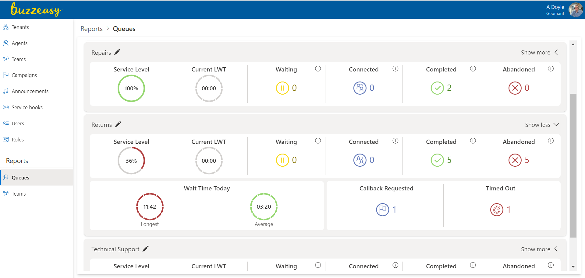
A sample queues report.
Teams Report
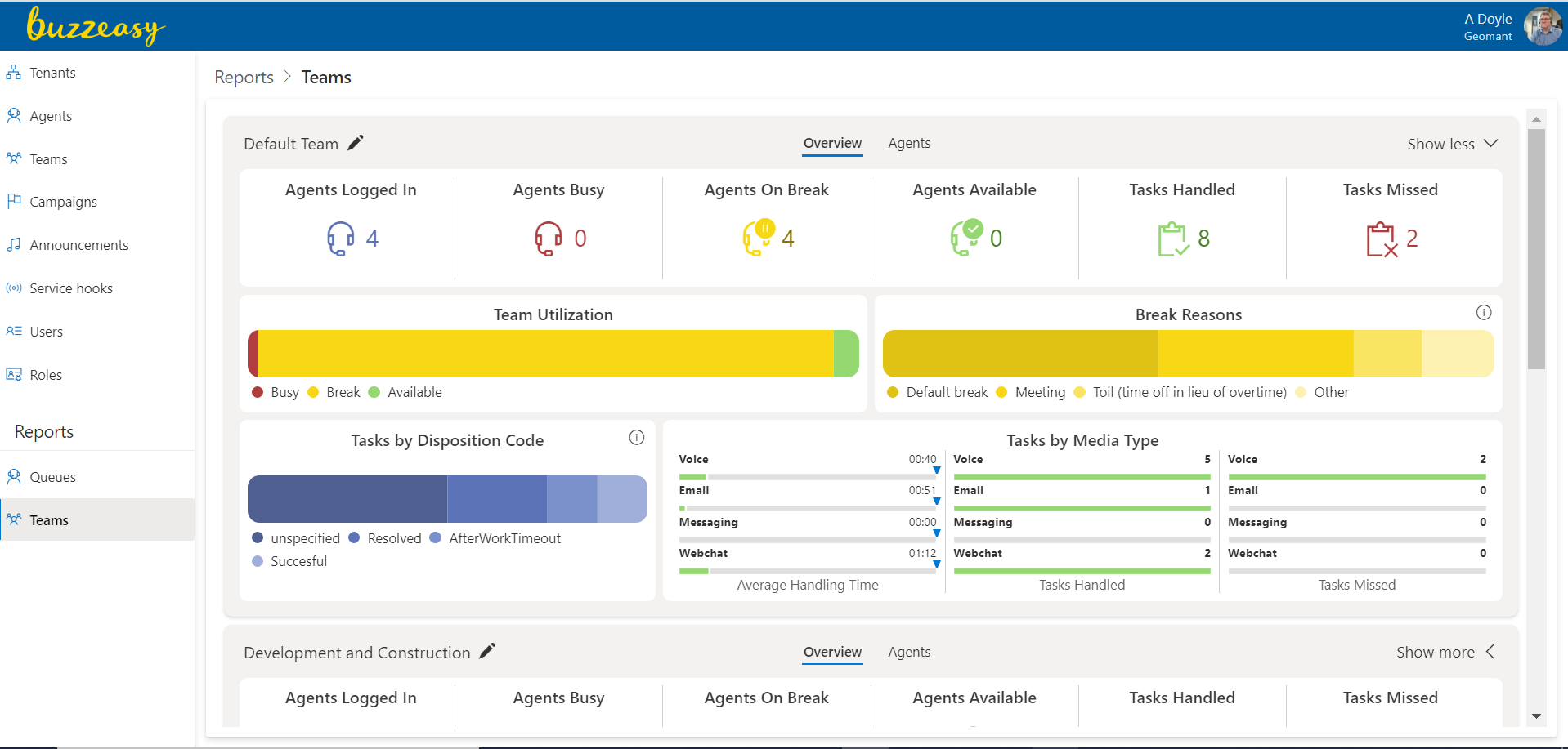
A sample Teams Report.
Show or Hide KPIs in Dashboards
While the design of the queues and teams dashboards are different to each other, both dashboards offer six summary, or key KPIs.
You may request to show more detail and see more KPIs than the six key KPIs on each of the dashboards.
You may wish to return to a summary view of six key KPIs, so you may opt to show fewer KPIs on each of the dashboards.
Show More KPIs
Each report dashboard displays summary KPIs at all times. Refer to these summary KPIs as the Key KPIs.
Choose to see more detail and show more KPIs, with the Show more option at the top right of each dashboard.
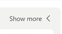
The Show more option displays further tiles of KPIs specific to each dashboard type.
Once the full set of KPIs are in view, the Show more button is replaced with a Show less button.
Find out more about showing more KPIs on the queues dashboards, in the queues article here.
Find out more about showing more KPIs on the teams dashboards, in the teams article here.
Show Fewer KPIs
When your dashboard displays all KPIs, you may wish to return to the summary view of key KPIs. With all KPIs visible the Show Less option appears at the top right of the dashboard.
Select the Show Less option to show just the key KPIs on your dashboard.
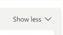
When the dashboard displays only the key KPIs, a Show more button replaces the Show less button
Show Details or Chart in KPIs
You may display details, or display a chart in many of the KPIs.
The reports use the same icon to show more details, or to display a chart depending on the KPI in question.

The icon appears as the letter i in a circle. Refer to this icon as the Information icon, or Info icon.
Info icon in Queues Dashboards
From the illustration above, taken from the queues dashboard, note the information icon at the top right of the Break reasons tile. In this case you select the information icon to display the details of the conversations, showing media type and where available, caller details.
Find out more about the KPIs in the queues dashboard here.
Info icon in Teams dashboards
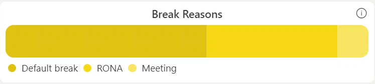
In the illustration above, taken from the teams dashboard, note the information icon at the top right of the Break reasons tile. In this case you select the information icon to display a chart.
Find out more about the KPIs in the teams dashboard, in the teams article here.
Data Thresholds - Highlight Critical KPI Values
The KPIs shown in the Data-visualizations may change color, or format, when the data reaches a certain critical level, or threshold.
This change in appearance based on a critical data value, clearly signals when the data has reached a value that requires action by a supervisor or an agent. This helps you to act quickly to regain your attainment towards your performance targets.
Refer to the value at which the data visualization changes in appearance as the data threshold.
 |
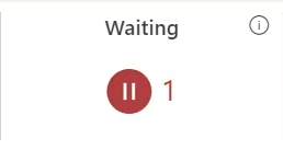 |
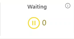
| Waiting KPI under threshold | Waiting KPI over threshold |
- In the illustration above the Waiting KPI, taken from the queues dashboard, shows how many conversations are waiting.
- In this case with zero calls waiting, the KPI displays in a yellow format.
- With one call waiting the KPI displays in red.
- A Supervisor has set the threshold of the Waiting KPI to one.
Edit Data Thresholds
You may edit the data thresholds to your own preferences on many of the KPIs. In this way you will specify the value at which their formatting changes.
You may also disable data thresholds for many of the KPIs, so their formatting remains the same regardless of value.
Editing the data thresholds enables you to set data thresholds appropriate to your contact center. This will allow you to maintain performance against targets. You may also change the threshold in a drive to improve performance.
To specify the individual KPI data thresholds on a specific dashboard, select Enable threshold edits.
Enable thresholds edits with the Enable threshold edits icon. This is found at the top left of the dashboard.

Find the Enable threshold edit icon at the top left of each dashboard.
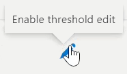
Confirm the Enable threshold edit icon, hover the pointer over the icon, the tip text Enable threshold edit appears.
Select the Enable threshold edit icon to allow KPI thresholds to be set.
In the dashboard, those KPIs for which a threshold may be set now appear with blue link text to their threshold settings.
It is intuitive to enable and set the thresholds of KPIs. The steps are as follows.
- Select Enable Threshold
- Select KPI
- If necessary enable the threshold with the slider control
- Set a threshold, this is usually a duration or a value.
- Select Save
Find the details to set the thresholds for each individual KPI in the teams report, in the teams report article here.
Find the details to set the thresholds for each individual KPI in the teams report, in the queues report article here.
Next Steps
Find out more about the Queues Report here.
Find out more about the Teams Report here.
Appendix - Permission to Access the Portal Reports - Supervisory Dashboards
Access to the portal reports is controlled by Buzzeasy role based access.
An administrator should configure your access to reports.
The permissions you are assigned as a Buzzeasy user control your access to Buzzeasy portal features.
The permissions are combined in roles and applied to users in the Buzzeasy Portal.
Find out more about permissions and roles here.
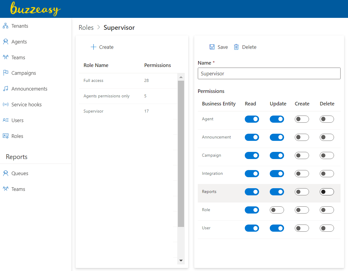
Reference - Reports Permissions
For reference purposes only, the permission to access portal reports is illustrated below
As a report user you may not have access to managing user roles and permissions.
You need Reports permission to access the Buzzeasy portal reports' dashboards.
Select Roles in the New Portal to manage roles.
You need read permission on Reports to view the supervisory dashboards in portal reports.
Reference - Access Monitoring Features
You need to be assigned as a Supervisor in the Agents section of the portal, to use the monitoring features. These features enable you to mentor and advise agents while they are in live conversations.
Find out more about assigning Supervisor status to an Agent here