Buzzeasy Portal Reporting
The Buzzeasy Portal is used to administer the Buzzeasy environment at a call center.
The portal also holds reports that enable you to view call center performance, understand the workload of the call center, monitor calls, and mentor agents while they are in live conversations with customers.
The performance data is shown in as near to real-time as technically possible.
The data may be current, such as the number of calls waiting, or it may be a daily summary such as the number of conversations handled.
Read the entire guide to learn about features of the portal reports and how to view and operate the reports.
This section of the guide details the benefits of the reports and the key elements found within them.
Report Benefits - Performance Data Monitoring
The reporting features in the Buzzeasy portal are referred to as the “Supervisor-dashboard” because they provide the contact center supervisor with information that provides insights into the contact center’s performance.
The reports consist of a number of dashboards, these present contact center performance data through data visualizations that make the data easy to understand.
Because the data on the report dashboards is easy to understand, the reports enable you as a contact center supervisor, to react quickly, and make interventions that preserve your progress towards performance targets.
Report Benefits - Operational Monitoring
Not only do the reports give you easy access to performance data, they enable operational benefits. You may use the performance reports to:
View the number and details of calls in your queue
Bring agents out of break
Monitor conversations
Intervene, and take control of an agents call
Provide mentoring to agents, by "whispering" a suggestion in a live call
Portal Report Organization
The portal features two reports, a Queues report and a Teams report.
Each reports display KPI data.
The KPI data in the reports is current or daily summary data.
The KPI data is displayed both as a value and through Data visualizations.
Each report shows one or more dashboards, or collections of Data visualizations and KPI data.
Reports Available
Queues
- Data about conversations. For example how many calls are waiting, and for how long.
Teams
- Data about agents. For example how many are logged in, and how many are actively handling conversations.
Bots
- Data about the bot usage and performance across your tenant, such as success % or abandoned count.
KPI Data
Key performance indicator is commonly abbreviated to KPI.
The reports show key performance indicator (KPI) data for the contact center.
This guide details the reports and all the KPIs displayed in each report dashboard.
Dashboards
Each report consists of one or more dashboards.
The queues report features a dashboard of data visualizations that represent KPI data.
- There is a separate dashboard for each queue. It shows data for just that queue.
The teams report features a dashboard of data visualizations that represent KPI data.
- There is a separate dashboard for each of your teams, It shows data for just that team.
The bot reports features a dashbord of data visualizations that represent KPI data.
- There is a separate dashboard for each of your bots, it shows data just for that bot.
Data Visualizations
Data visualizations are used to make the KPI data easier to understand.
Data visualizations in the portal reports are graphic representations of the KPIs. They are an efficient way of communicating data or information.
Examples used in the reports include bar charts, stacked row charts and "speedometer" displays.
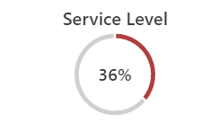
A speedometer visualization
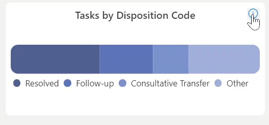
A stacked horizontal bar chart
Formatting changes are also a form of data visualization. If a KPI or visualization that usually displays in green, displays red, this indicates the data has exceeded a threshold and requires supervisor intervention.
Scope of Report Data
Current and Daily Summary Data
Current data reports on the current value of a KPI. It is data that is passed along to the report user as quickly as it gathered, or in near real-time.
- Examples of current data shown in the reports include: the number of calls waiting, or the number of agents logged in.
Daily summary data compounds or updates throughout the day, and resets at the end of the day. It includes running totals, current averages, and current maximum or minimum values.
- Examples of daily summary data shown in reports include: the average customer wait time, or the longest call wait time
The current and daily summary data give you insights into the call center's current performance. This enables you to intervene immediately to threats to the call center's performance targets.
Historical Data
The dashboard does not display historical data.
Historical data is presented in Buzzeasy Power BI Reports. Find out more about about Buzzeasy historical reporting here.
Next Steps
If you are familiar with navigating the reports: